Last update on: March 15, 2021
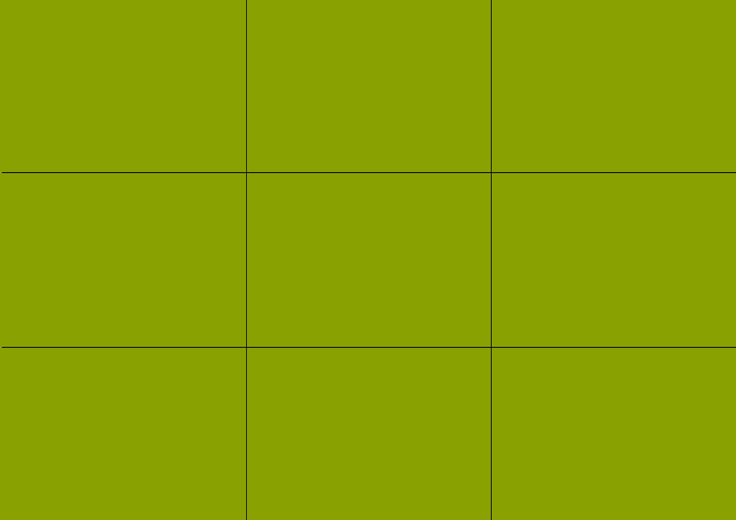
This is one of the most talked-about photography composition techniques. All you need to do is to divide your frame vertically into three equal parts and horizontally into three equal parts. By placing your subject on one of the four points where these dividing lines meet, you will encourage the viewer away from the center of the frame. This forces them to look around the image and makes your composition more interesting.


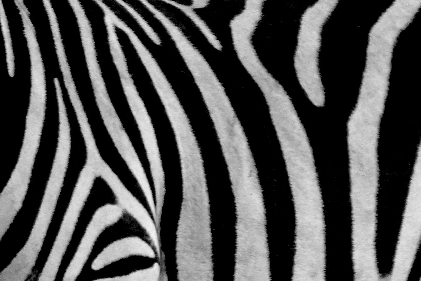
Human beings are naturally attracted to patterns. They are visually attractive and suggest harmony. Patterns can be manmade like a series of arches or natural like the petals on a flower. Incorporating patterns into your photographs is always a good way to create a pleasing composition. Less regular textures can also be very pleasing on the eye.


The rule of odds states that images are more visually appealing when there is an odd number of subjects. For example, if you are going to place more than one person in a photograph, don’t use
two, use 3 or 5 or 7, etc.
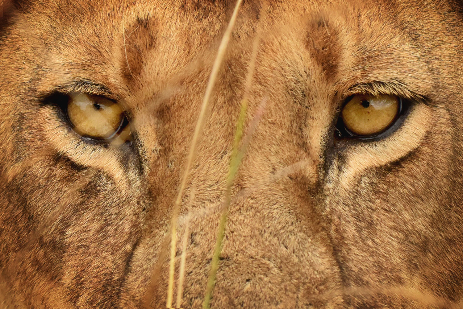
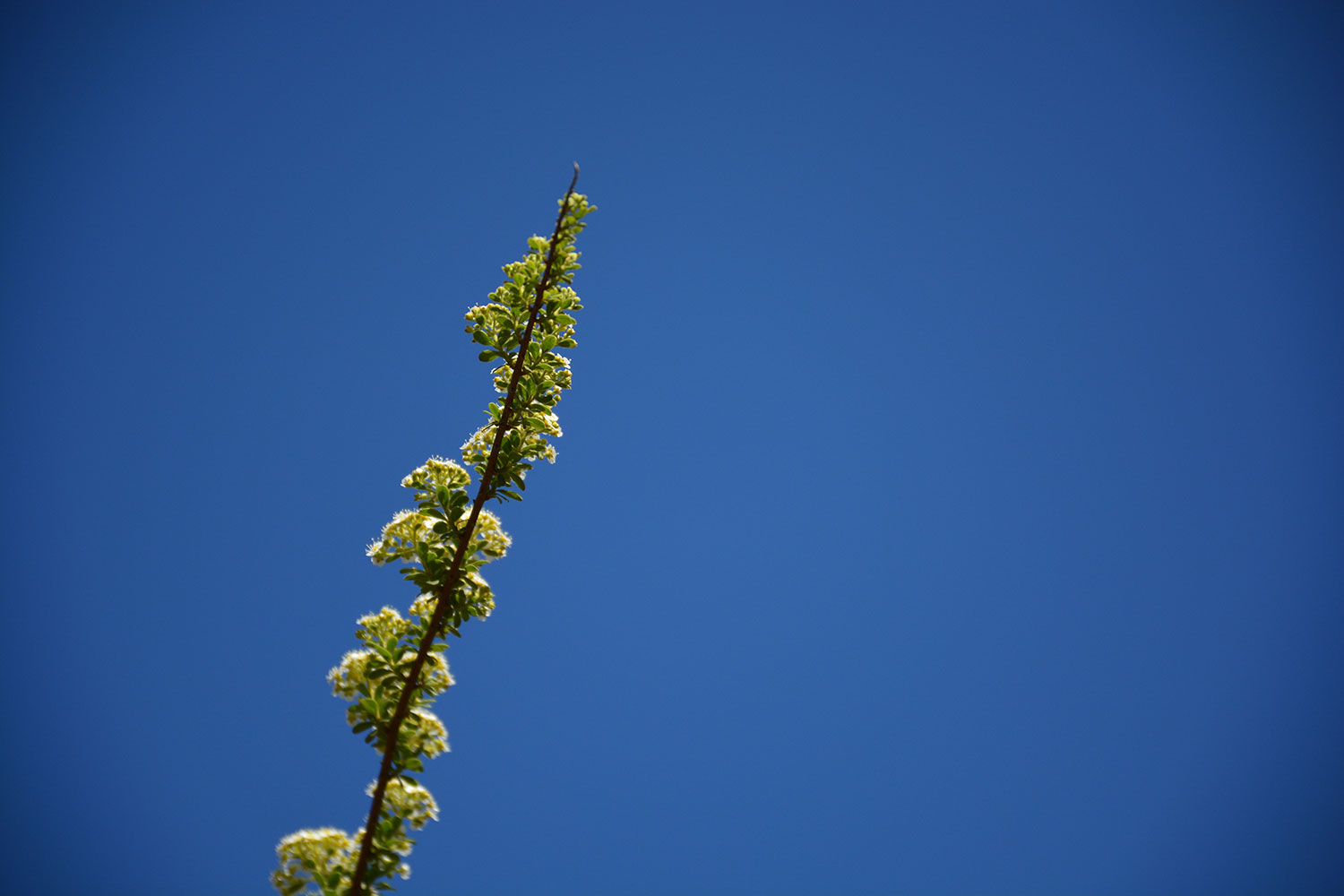
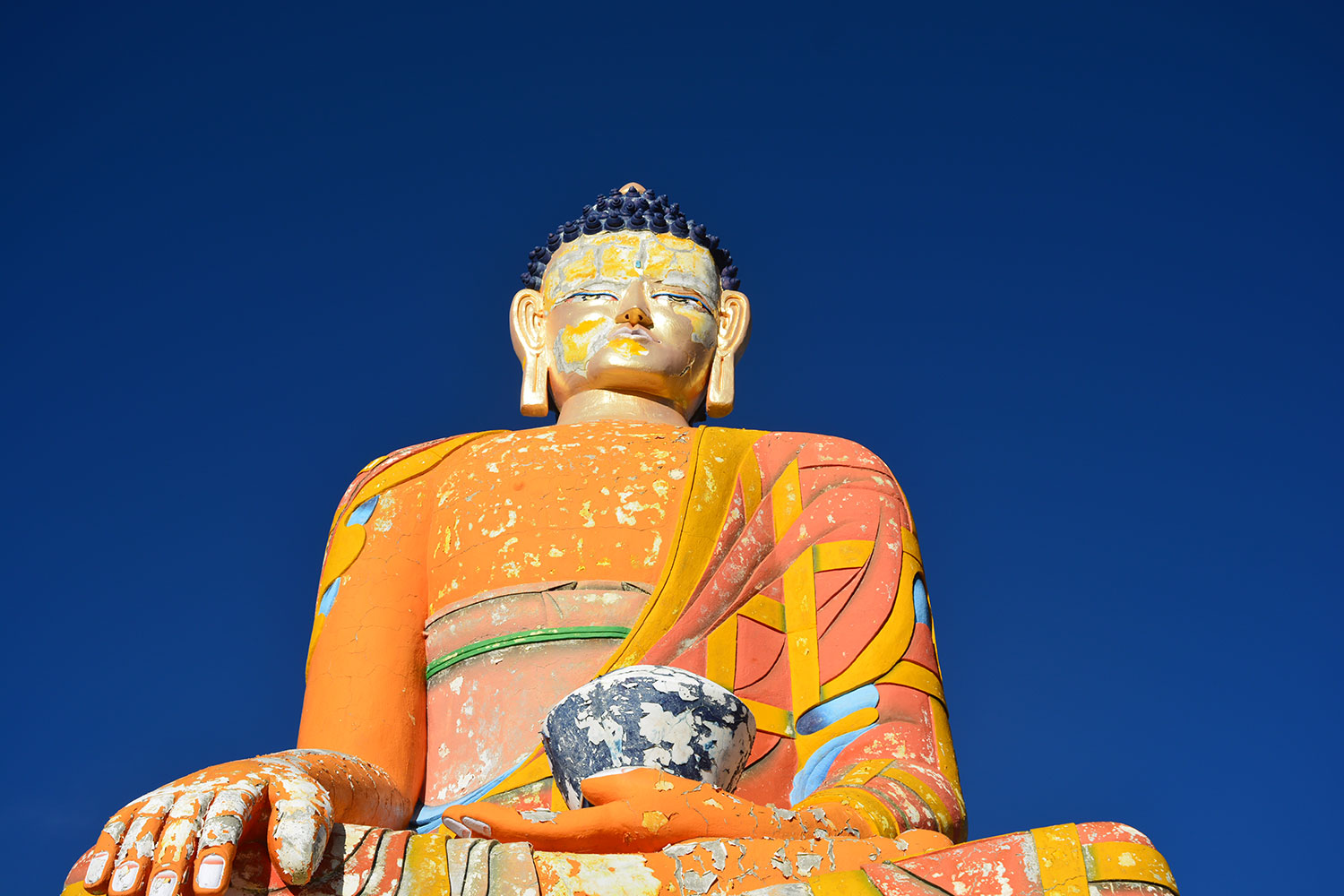
Leaving a lot of empty or ‘negative’ space around your subject can be very attractive. It creates a sense of simplicity and minimalism. Like filling the frame, it helps the viewer focus on the main subject without distractions.

Minimalism is the composition which expresses ‘less is more’. Simplicity is the main key to this composition.

Juxtaposition is the composition which presents two or more elements in a scene that can either contrast or the opposite with each other or complement each other. These photographs approach to tell a story.
For example:
1. A fat person next to a skinny person
2. The tall person next to a short person
3. Dark colors next to light colors
4. Circles next to rectangles
5. Old people next to young people
Fibonacci Series
0, 1, 1,2,3,5,8,13,21…….n
The golden ratio is an invisible leading line which follows to maintain the composition which nature itself follows.
It is believed that the golden spiral method of composition has been in existence for over 2,400 years having been devised in Ancient Greece.
It is widely used in many types of art as well as architecture as a way of creating aesthetically pleasing compositions. It was particularly well employed in Renaissance art.
The Golden Ratio, also sometimes called the Fibonacci Spiral.
The value of the golden ratio is 1.61803398875
a/b = (a+b)/a = 1.61803398875
We do not need to memorize this, we need to just understand it.
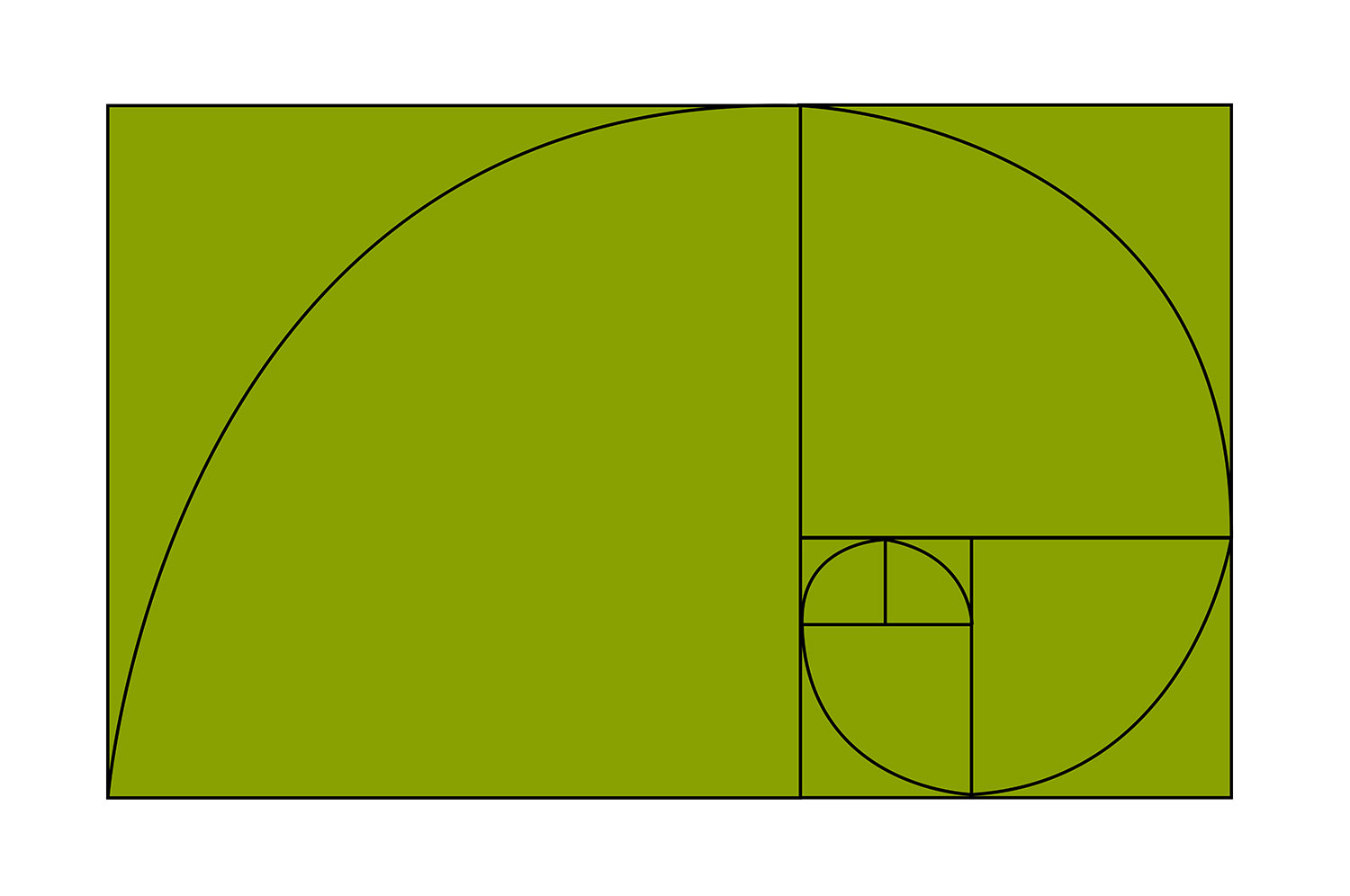

Golden Spiral
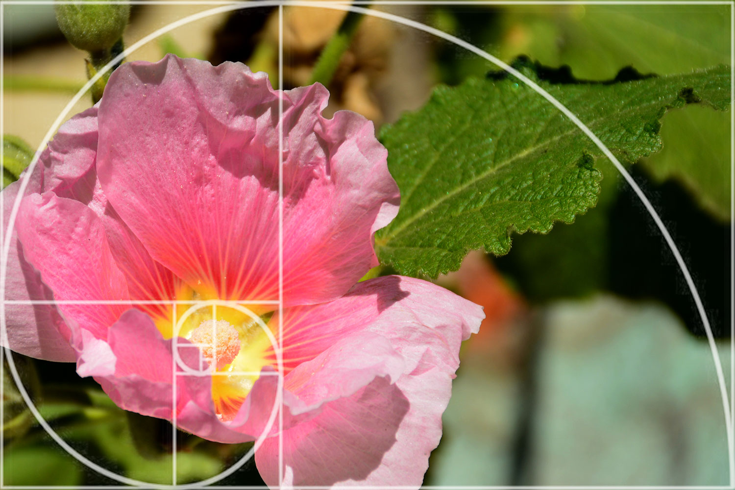
Example of some photographs of Golden Ratio

To know more about 30+ photography composition like Symmetry, Frame within the Frame, Diagonals, and Triangles, Golden Triangle etc. collect this book.